This tutorial will be covering how to create a bottom tab navigator in React. There are currently many libraries in React Native but not as much in React.
And yet, as more and more users browse the internet on their phones, it is important for websites to replicate a truly mobile experience. As a result, I decided to do away with the typical hamburger and instead implement a real bottom tab navigator for the web.
Main technologies used in this tutorial:
- Font Awesome 5
- React Router 5
- Reactstrap (Bootstrap for React)
1. Setup and dependencies
Let’s create our project and set up the libraries needed.
npx create-react-app my-app
cd my-app
npm i --save react-router
npm i --save react-router-dom
npm i --save @fortawesome/fontawesome-svg-core  @fortawesome/free-solid-svg-icons @fortawesome/react-fontawesome
npm i --save bootstrap
npm i --save reactstrap
For reactstrap to work, we also need to import Bootstrap CSS into our src/index.js:
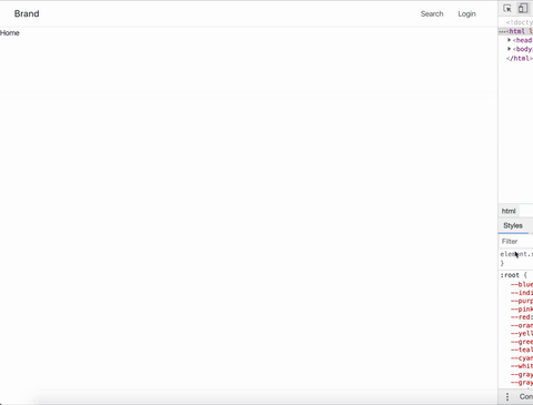
import 'bootstrap/dist/css/bootstrap.min.css';If you do npm start, you should see the default starter page with the react logo:

2. Create the different screens
Let’s continue by setting up our different pages. Create a folder pages in src and create a file for each of your views. I went with Home, Search, and Login. I am not really interested in the content of each page so here is an example of Home.js:
import React from 'react';

const Home = (props) => {
return (
    <div>
      Home
    </div>
  )
};

export default Home;
With this done, I now have a src/pages/Home.js, src/pages/Search.js and src/pages/Login.js and we can now set up our Router.
3. Set up routes and router in React
React Router offers different kinds of routes depending on your needs:
- BrowserRouter (uses regular URL. For example,
/homeor/search) - HashRouter (uses the hash portion of the url. For example,
/#/home)
For this tutorial, I will go with BrowserRouter. Here is our final App.js:
import React from 'react';
import './App.css';
import { BrowserRouter, Switch, Route } from "react-router-dom";
import Home from './pages/Home';
import Search from './pages/Search';
import Login from './pages/Login';

function App() {
  return (
    <div>
      <BrowserRouter>
        <Switch>
          <Route path="/home" component={Home} />
          <Route path="/search" component={Search} />
          <Route path="/login" component={Login} />
        </Switch>
      </BrowserRouter>
    </div>
  );
}

export default App;
After importing our views (Home, Search, Login), we use Switch which renders the first component to match the path. So, if you go to http://localhost:3000/search, the app will render the Search Component.
If you change the url (http://localhost:3000/search or http://localhost:3000/home), you should see the correct view rendering.
4. Create a Top Bar navigation in React
Now that our routing is set up, let’s add some user-friendly navigation by starting with the top bar. In src, I will create Navigation.js and it will look like this:
import React from 'react';
import { Nav, NavItem} from 'reactstrap';
import { NavLink } from 'react-router-dom';

const Navigation = (props) => {
	return (
      <nav className="navbar navbar-expand-md navbar-light sticky-top" 	role="navigation">
        <div className="container-fluid">
            <a className="navbar-brand" href="/home">Brand</a>
            <Nav className="ml-auto">
              <NavItem>
                <NavLink to="/search" className="nav-link">
                  Search
                </NavLink>
              </NavItem>
              <NavItem>
                <NavLink to="/login" className="nav-link">
                  Login
                </NavLink>
              </NavItem>
            </Nav>
        </div>
      </nav>
  )
};

export default Navigation;
A straightforward navbar with a brand on the left and items on the left (search, login). The sticky-top class makes sure it stays at the top.
Let’s quickly add it to our App.js:
import React from 'react';
...
import Navigation from './Navigation';
...

function App() {
  return (
    <div>
      <BrowserRouter>
        <Navigation />
        <Switch>
         ...
        </Switch>
      </BrowserRouter>
    </div>
  );
}

export default App;
We end up with this:
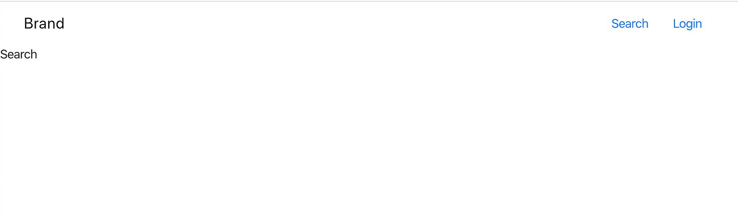
This is nice and all but as I mentioned, the emphasis is to have both a mobile-friendly and desktop-friendly navigation.
5. Create a Bottom Tab navigation
Let’s go back to Navigation.js. We need to determine what tabs we need. Again, I am going to keep Home, Search, and Login. Each tab needs an icon which are available thanks to Font Awesome. I am also going to define a tabs object to keep all that information so as to not repeat code.
In our Navigation.js, we add:
import React from 'react';
...
import { FontAwesomeIcon } from '@fortawesome/react-fontawesome';
import { faSearch, faHome, faUserCircle } from '@fortawesome/free-solid-svg-icons';

const tabs = [{
  route: "/home",
  icon: faHome,
  label: "Home"
},{
  route: "/search",
  icon: faSearch,
  label: "Search"
},{
  route: "/login",
  icon: faUserCircle,
  label: "Login"
}]

const Navigation = (props) => {
...
Each tab consists of an icon, a label and a route (aka where the page should redirect after clicking the tab).
With this, we can then move on to defining our bottom tab navigator:
const Navigation = (props) => {
return (
<div>
{/* Top Bar*/}
<nav className="navbar navbar-expand-md navbar-light sticky-top" role="navigation">
....
</nav>
{/* Bottom Tab Navigator*/}
<nav className="navbar fixed-bottom navbar-light" role="navigation">
<Nav className="w-100">
<div className=" d-flex flex-row justify-content-around w-100">
{
tabs.map((tab, index) =>(
<NavItem key={`tab-${index}`}>
<NavLink to={tab.route} className="nav-link" activeClassName="active">
<div className="row d-flex flex-column justify-content-center align-items-center">
<FontAwesomeIcon size="lg" icon={tab.icon}/>
<div>{tab.label}</div>
</div>
</NavLink>
</NavItem>
))
}
</div>
</Nav>
</nav>
</div>
)
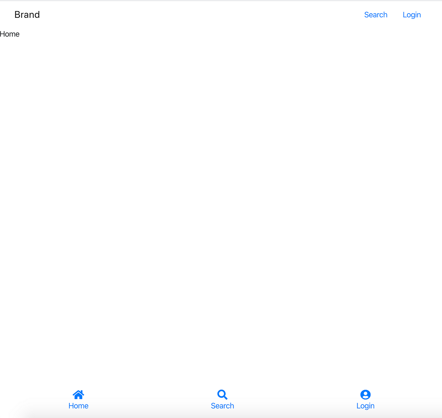
};Under our top nav, we add our bottom <nav>. We use the class fixed-bottom (thanks Bootstrap!) to make it stick to the bottom. Inside, we have a row with an important class: justify-content-around. Here is the Bootstrap documentation if you need a refresher on flex, but in brief, it’s what allows us to put even distancing between our tabs.
Our tab itself is composed of a Font Awesome icon with a label. To put the icon on top of the label and center them both, we use once again use flex and add d-flex flex-column justify-content-center align-items-center.
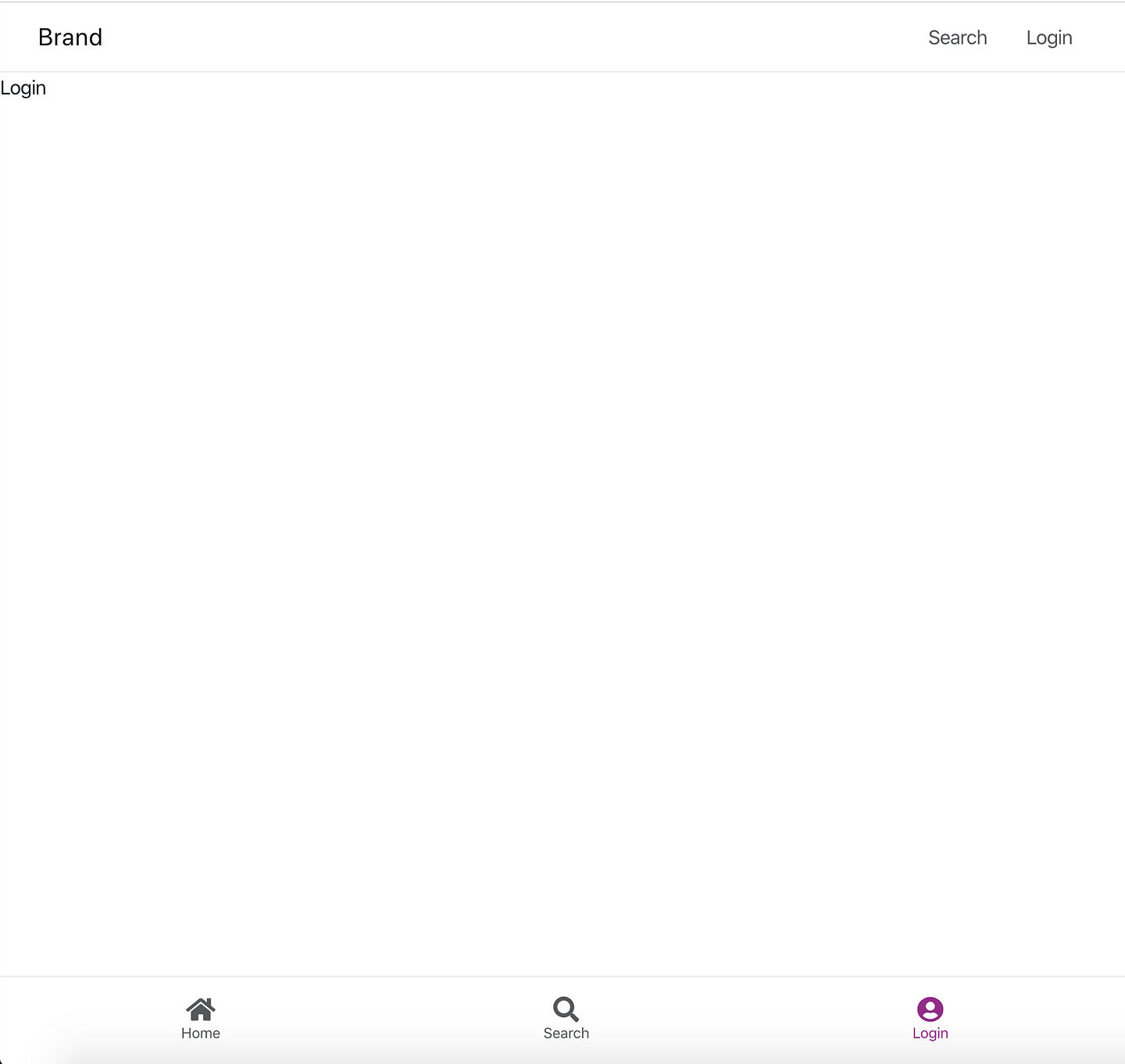
You should have something like this:
Extra: add some styling to your navigation
This is nice but it could be a bit better. First, let’s start with a tiny bit of styling. in src/App.css, remove everything in it and instead add:
.navbar {
  border-bottom: solid 1px #EBEBEB;
}
.bottom-tab-nav {
  border-top: solid 1px #EBEBEB;
}
.nav-link,
.bottom-nav-link {
  color: #55575b;
}
.bottom-nav-link.active {
  color: #922c88;
}
.bottom-tab-label {
  font-size: 12px;
}
Just to add a border on our navigation and a bit of coloring, especially when the tab is active. Going back to our src/Navigation.js, let’s add the necessary classes:
<nav className="navbar fixed-bottom navbar-light bottom-tab-nav" role="navigation">
        <Nav className="w-100">
          <div className=" d-flex flex-row justify-content-around w-100">
            {
              tabs.map((tab, index) =>(
                <NavItem key={`tab-${index}`}>
                  <NavLink to={tab.route} className="nav-link bottom-nav-link" activeClassName="active">
                    <div className="row d-flex flex-column justify-content-center align-items-center">
                      <FontAwesomeIcon size="lg" icon={tab.icon}/>
                      <div className="bottom-tab-label">{tab.label}</div>
                    </div>
                  </NavLink>
                </NavItem>
              ))
            }
          </div>
        </Nav>
      </nav>
You should be seeing this:
6. Make your top and bottom bars responsive
Almost there! We have all the components in place but there is only one issue. Both navigations are displayed! What we really need is for the bottom tab navigator to display for ipad and mobile screen sizes and for the top nav to appear for larger displays.
Once again, Bootstrap comes to the rescue. The library has a handy display feature.
The formula works like this: .d-{breakpoint}-{value} for sm, md, lg, and xl where value can be none, inline, block, …
Therefore, d-none would hide on all screen sizes but d-sm-none d-md-block would display on medium and larger screen but hide for small and extra small.
Using this logic, we will add a couple of classes in our Navigation.js file:
import React from 'react';
...
const Navigation = (props) => {

return (
    <div>
      {/* Top Bar*/}
      <nav className="navbar navbar-expand-md navbar-light d-none d-lg-block sticky-top" role="navigation">
        ...
      </nav>
      {/* Bottom Tab Navigator */}
      <nav className="navbar fixed-bottom navbar-light d-block d-lg-none bottom-tab-nav" role="navigation">
        ...
      </nav>
    </div>
  )
};

export default Navigation;
We added d-none d-lg-block on the top bar which means it will be hidden for smaller screen sizes and the inverse d-block d-lg-none on our bottom tab navigator.
It’s over. With this, we now have the final result I showed at the beginning of our tutorial. Namely, a mobile-friendly and a desktop-friendly navigation both displayed when needed.
Here is the full code: https://github.com/mariesta/bottom-tab-navigator